Thesis Project
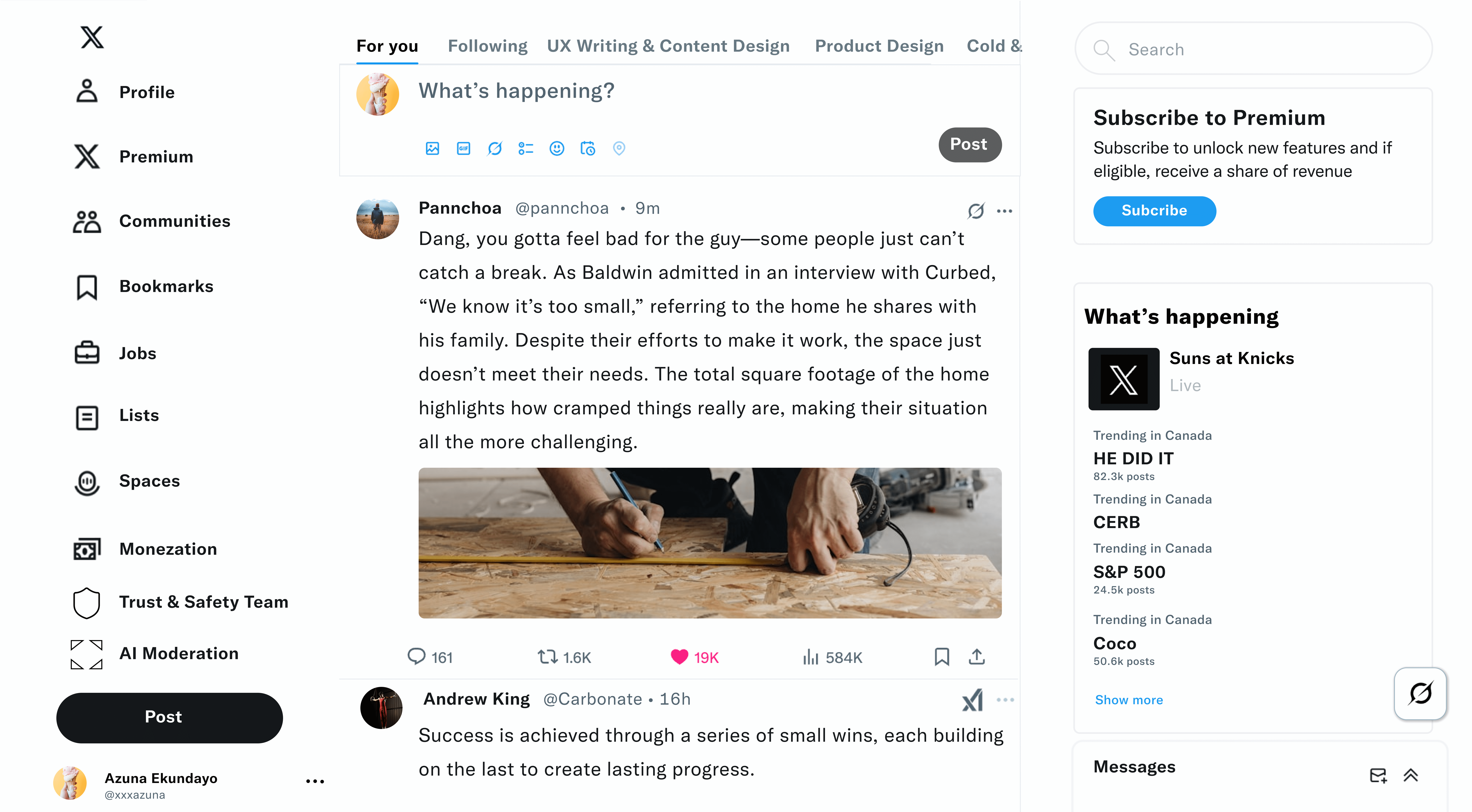

This thesis explores the use of both an AI moderation tool and a human moderation support system on X to detect and filter harmful content, aiming to reduce cyberbullying and create a safer environment for youth. The AI tool is designed to improve the speed and accuracy of content review, while the human moderation tool enhances the moderator experience by making workflows more intuitive and effective within X’s user interface. A key challenge was identifying the right features for each tool—striking a balance between moderation effectiveness, user control, and overall user experience.

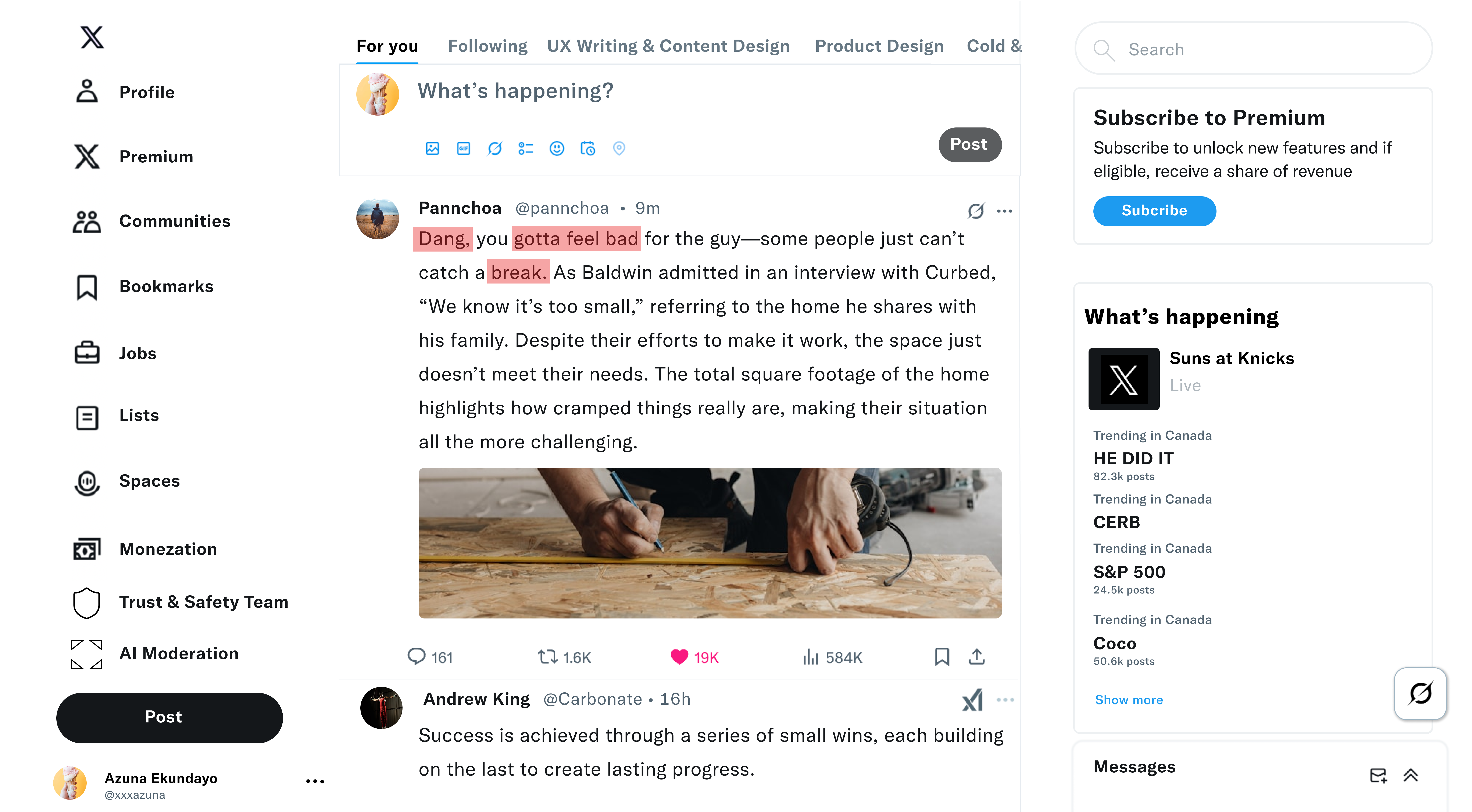
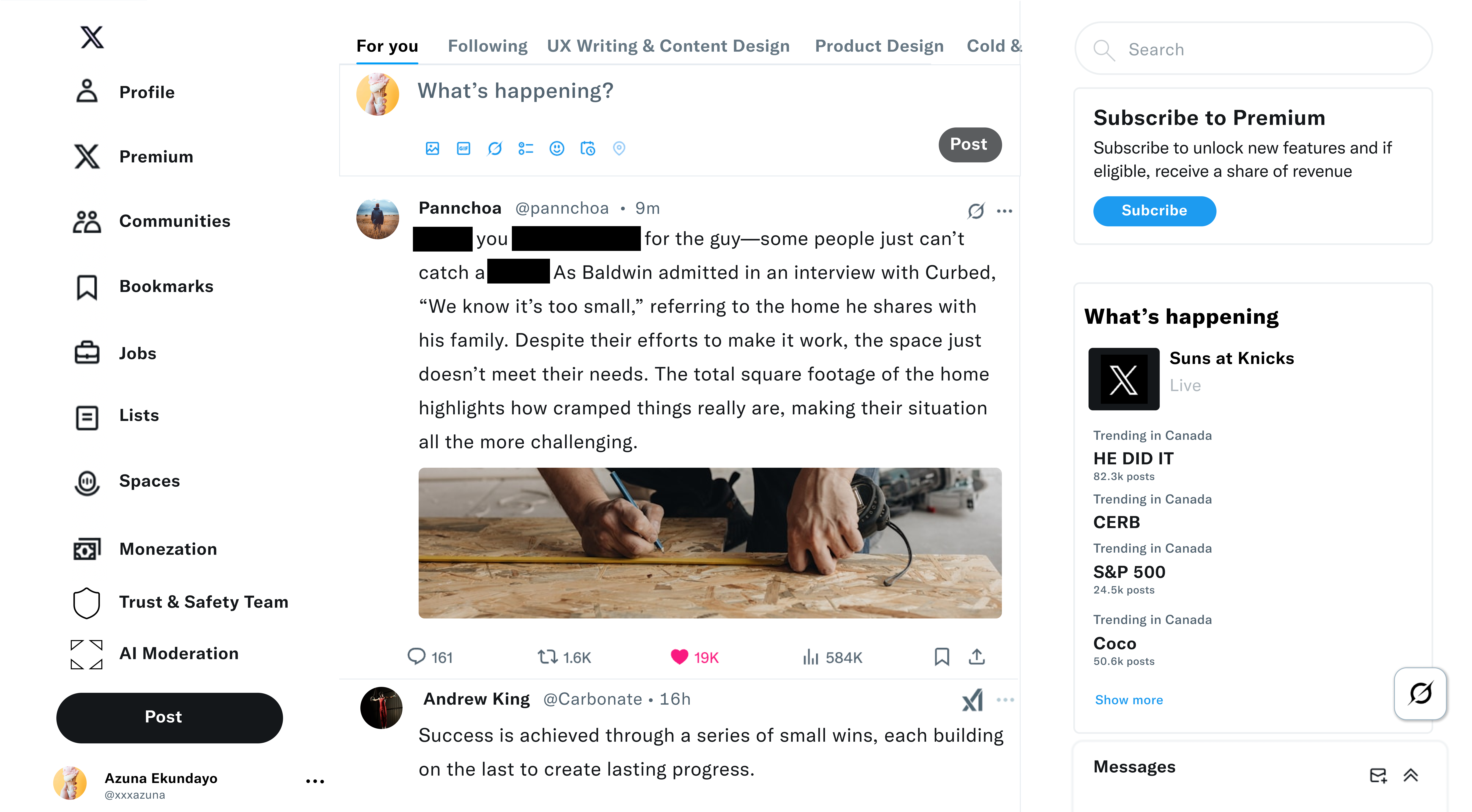
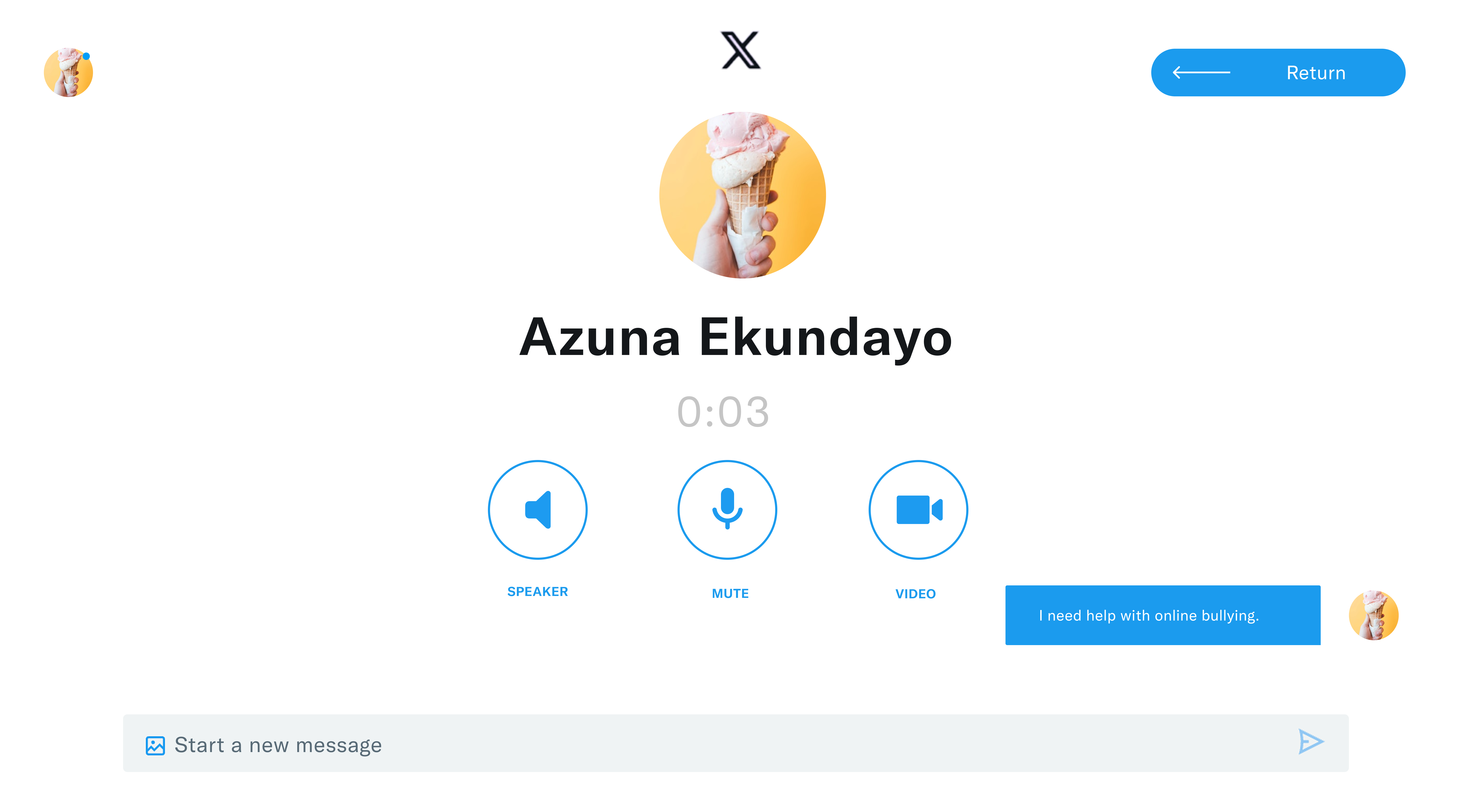
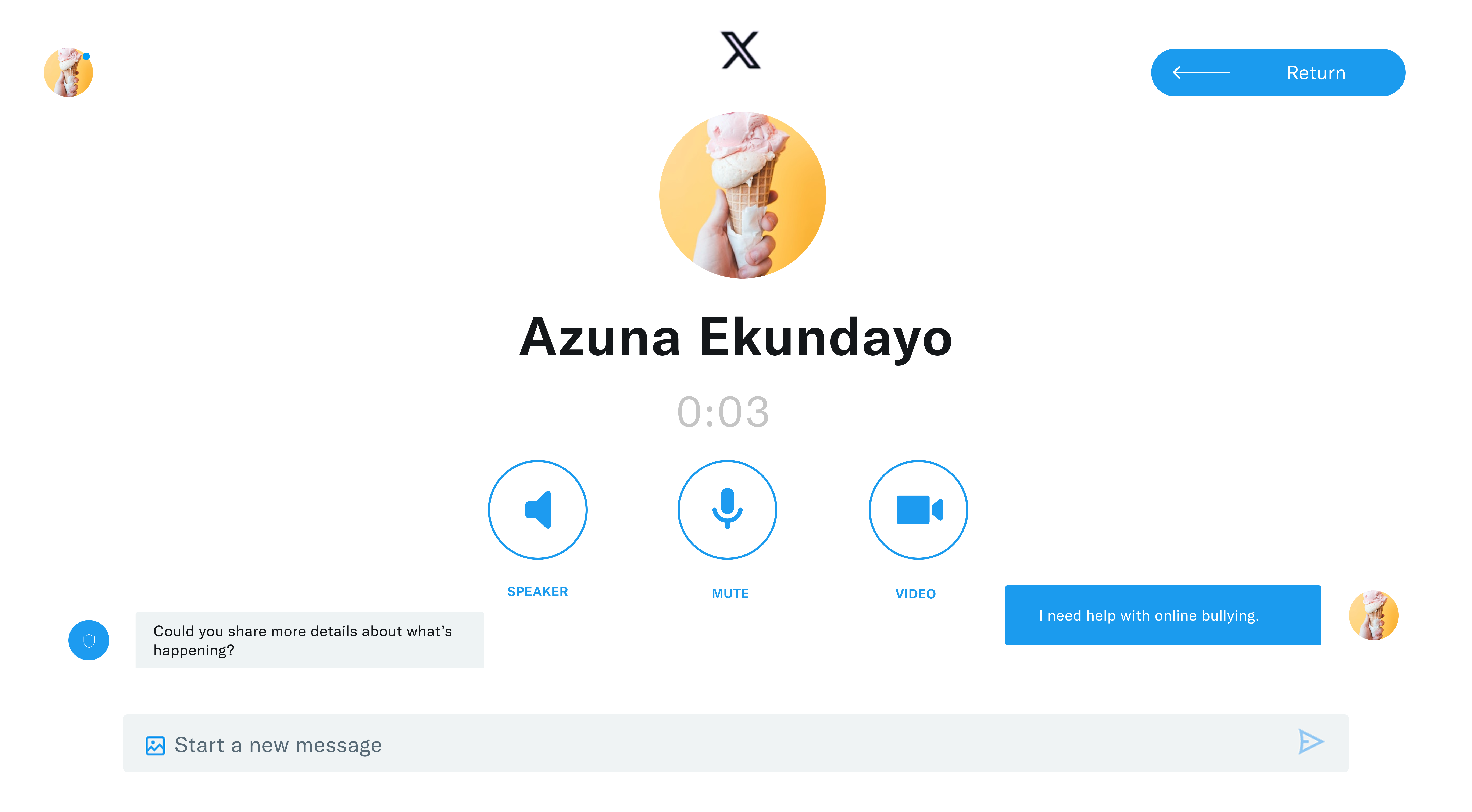
This desktop version presents a sequence of high-fidelity wireframes that demonstrate the AI Moderation Tool in action. Red bars highlight harmful words that have been detected, while black bars indicate that these words have been removed. The design also showcases the Human Moderation Tool. Represented by a shield icon labeled "Trust & Safety Team," this feature allows users to initiate contact with a human moderator. After clicking the shield icon, the user is taken to a page where an audio call is automatically started, with the option to switch to a video call. Users can also send messages to the moderator directly from this page.
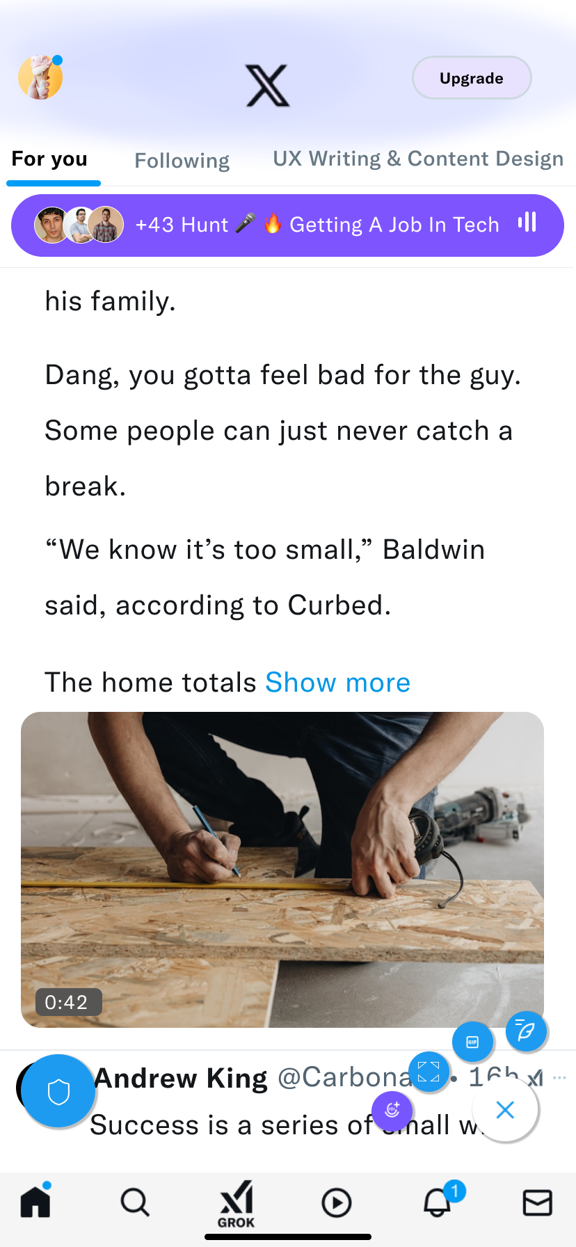
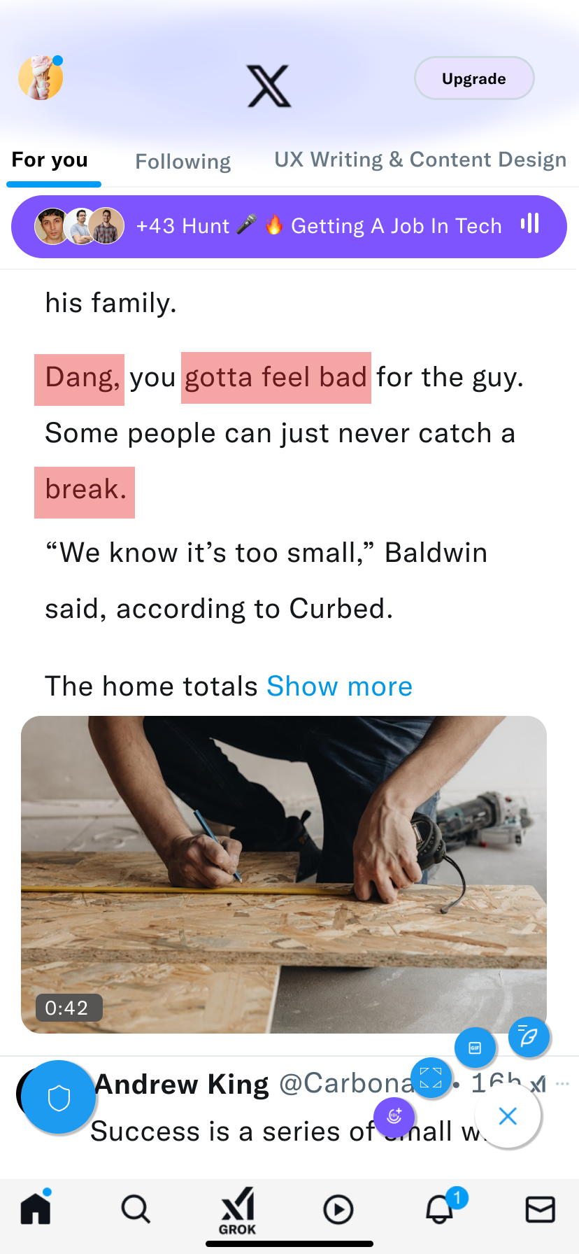
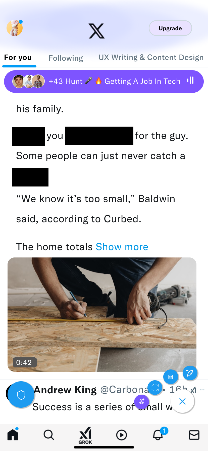


Similar to the desktop version, I designed a mobile version that presents a sequence of high-fidelity wireframes demonstrating the AI Moderation Tool in action. Red bars indicate harmful words that have been detected, while black bars show that these words have been removed. The mobile design also features the Human Moderation Tool, represented by a shield icon. Tapping the shield directs the user to a page where an audio call is automatically initiated, with the option to switch to a video call. Users can also send messages to the human moderator directly from this screen.
For my thesis project, I chose to redesign the X interface (formerly Twitter) by mimicking its existing visual style while exploring improvements in layout and interaction. To maintain consistency with the platform’s established identity, I retained both the original color palette and typography. I used Chirp, X’s official typeface, to ensure visual cohesion and preserve the familiar tone of the platform.
I developed an AI moderation tool and strengthened the human moderation system by incorporating intuitive safety features to combat cyberbullying and detect harmful content targeting youth. These solutions were successfully integrated into X, enhancing content review efficiency and improving the moderator experience.
I learned the value of conducting thorough research and how the insights gained can strengthen ideas and enhance the quality of your solutions.