Sleep Tracker
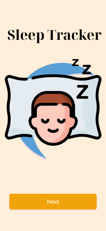
The goal of this project was to design and develop a simple, responsive sleep tracker that evaluates sleep duration and performance, while remaining completely free and accessible—no signups, logins, or onboarding required. The main challenge was building a user-friendly experience with full CRUD functionality through a custom REST API and database schema. I focused on applying clean visual design and responsive layout to ensure seamless interaction across devices.
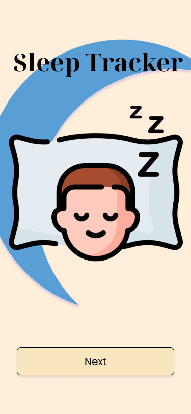
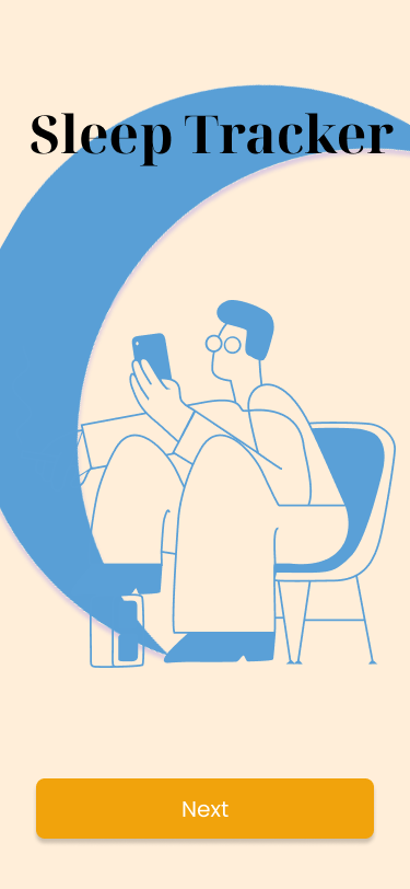
These early prototypes explore initial design directions for the sleep tracker. I experimented with various illustrations, colors, and icons to visualize the app’s look and guide the overall design approach.
To establish a clear design direction for my sleep tracker, I drew visual inspiration from a concept I discovered on Dribbble. At first, I lacked a defined aesthetic, but the use of black and blue in the reference design helped shape my visual approach. Through analysis, I found that this color pairing effectively conveyed a calming, nighttime atmosphere—ideal for a sleep-focused app. Key UI elements, such as the plus icon, also stood out and influenced their inclusion in my own design.
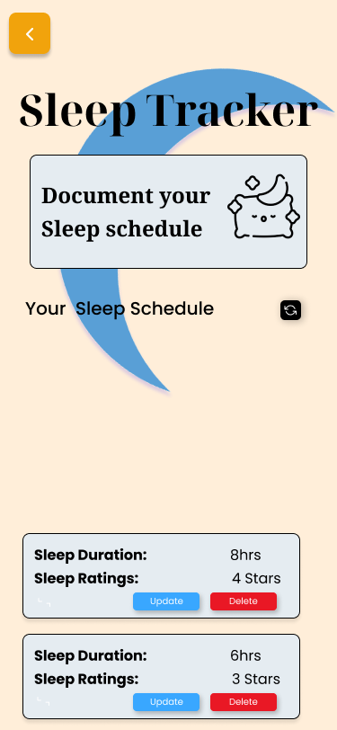
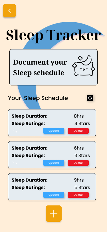
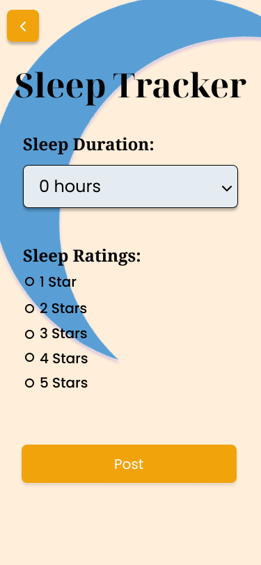
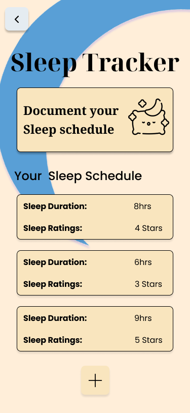
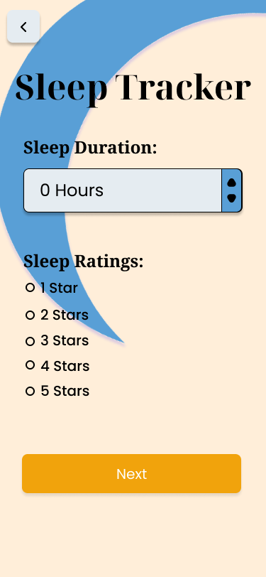
To create a cohesive and calming experience, I developed a design system that reflects the restful nature of sleep. Blue, known for its tranquil qualities, became the dominant color in my interface, with various shades used throughout the design to maintain a consistent tone. I introduced accent colors like yellow, red, and black to highlight specific interactive elements such as the delete, refresh, and add (+) buttons, ensuring they stood out while still fitting within the overall visual style. The color palette included #39A7FF, #FFEED9, #E5ECF1, #F1A30C, #000000, #FFFFFF, #E91825, and #599FD6, each selected to support clarity, mood, and usability. For typography, I used a combination of Noto Serif and Poppins to create a clear hierarchy and maintain visual interest. Noto Serif Display Bold was used for prominent titles like “Sleep Tracker,” while Noto Serif Bold handled subheadings such as “Sleep Ratings” and “Sleep Duration.” To add contrast, I incorporated Poppins Medium for headings like “Your Sleep Schedule,” and used Poppins Bold and Regular together to format body text in a way that clearly distinguished labels from values—for example, “Sleep Duration” in bold and “8 hrs” in regular weight. Altogether, these visual decisions created a consistent, readable, and engaging design system tailored to support the purpose and experience of the sleep tracker.
Noto Serif Display Bold 48px
Noto Serif Bold 24px
Body Text
Poppins Bold 16px
Body Text
Poppins Medium 20px
Body Text
Poppins Regular 16px
I created a functional sleep tracker that evaluates sleep duration and performance without requiring logins or onboarding. I successfully translated my high-fidelity designs into code, building a fully interactive web app with CRUD functionality. The visual design choices helped create a cohesive and engaging user experience.
I learned the importance of starting with a finalized high-fidelity design before moving into development. In the early stages, I ran into challenges where the code couldn’t fully reflect the design I initially created, which forced me to make multiple revisions. This experience taught me that having a clear, detailed design from the start ensures better alignment between design and implementation, ultimately saving time and reducing inconsistencies.